Bryan Brunot

I reshaped one fixed homepage into a flexible discovery system for 12 brands.

Elevate Outdoor Collective manages 12 distinct outdoor brands through one shared commerce platform. I redesigned its homepage framework so each brand could tell a different story while giving shoppers clearer paths into products and categories.

MacBook Pro displaying the redesigned Völkl homepage
Role
UX/UI Designer
Scope
Research & audit
UX/UI design
Prototyping
Design system
Tools
Figma
ChatGPT
Microsoft Clarity
Impact
23.3% increase in below-fold interaction

Problem

Across 12 brands, one fixed homepage structure carried every story. It leaned too heavily on the hero, then stacked lower-priority content in the same order.

  • Momentum dropped quickly after the fold.
  • Each brand had different shoppers, products, and campaign priorities.
  • Important product and category paths appeared too late.

The page was consistent, but it was too static and linear. It did not give shoppers enough direction after the first story.

Solution

I grouped existing homepage modules into tiers based on emphasis and purpose. Each tier defined which modules should lead, support, or guide shoppers into products and categories.

Teams could rearrange or repeat modules to fit each brand's shopper, story, and business goal while staying inside the shared CMS. I led the work from behavioral research and system strategy through design, handoff, and implementation QA.

01. Research

Question.

We knew engagement dropped below the fold. Were shoppers finished, or was the fixed structure failing to give them a clear reason to continue?

What I reviewed.

I mapped the fixed homepage structure and reviewed heatmaps across all 12 brands. K2 Skates became the representative view for how shoppers moved from the homepage into products and categories.

Current structure analysis

K2 homepage scroll, attention, click, and fixed-structure analysis

Scroll · Attention · Clicks · Fixed structure

02. Module review

What I reviewed.

I reviewed how each module drew attention, supported interaction, enabled shopping, and carried a story. The library already had enough range.

What I built.

I grouped modules by role and emphasis, then tested an initial system for how they could work together across a page.

Available modules

Review of available homepage modules and development of the initial role-based system

Module audit · Role and emphasis · Working composition · Working rules

03. Tier system

The model.

I defined four roles: Lead, Support, Bridge / Discover, and Brand / Utility. Each one described a module's emphasis and job in the shopper journey.

The rule.

Tier described how much emphasis a module could carry and the role it played. It did not prescribe where the module had to appear.

Tier system

Four-tier homepage system with role definitions, use guidance, and composition rules

Lead · Support · Bridge / Discover · Brand / Utility

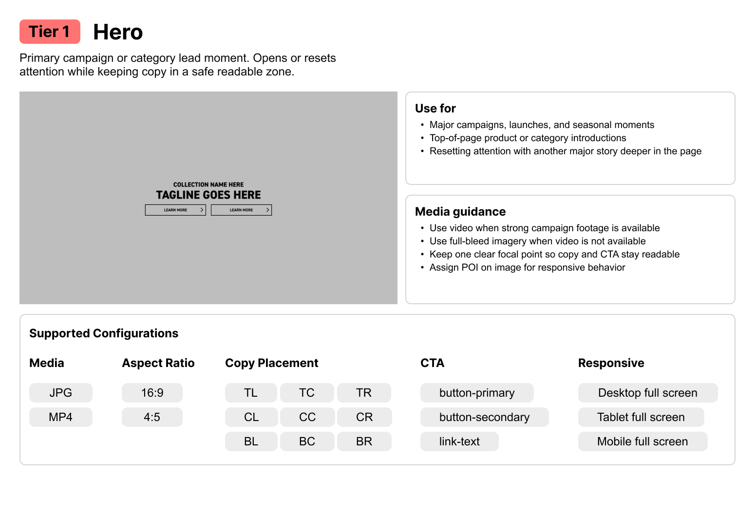
Tier 1 Hero module usage and configuration guidance
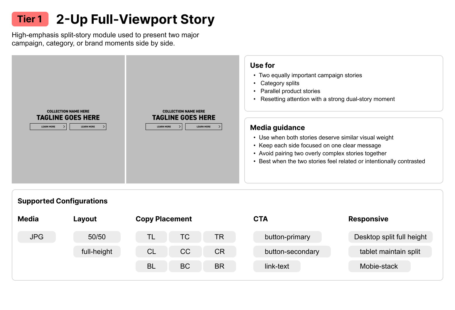
Tier 1 two-up full-viewport story module usage and configuration guidance
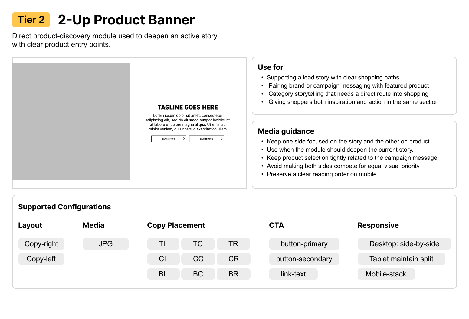
Tier 2 two-up product banner usage and configuration guidance
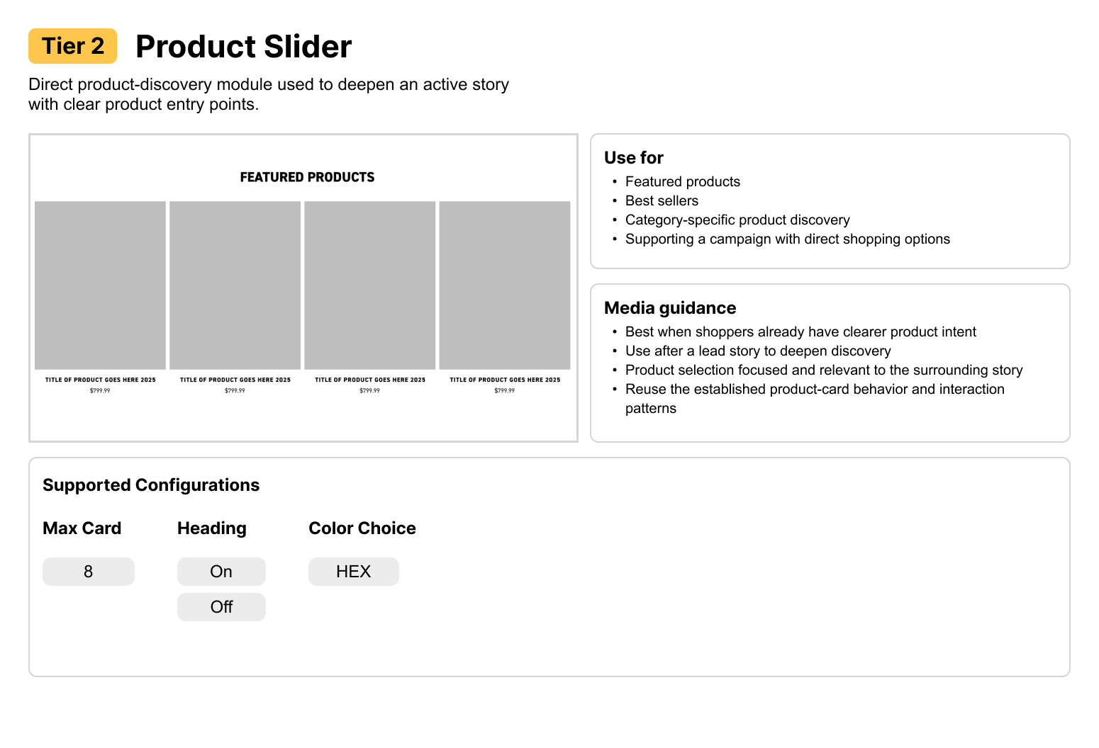
Tier 2 product slider usage and configuration guidance
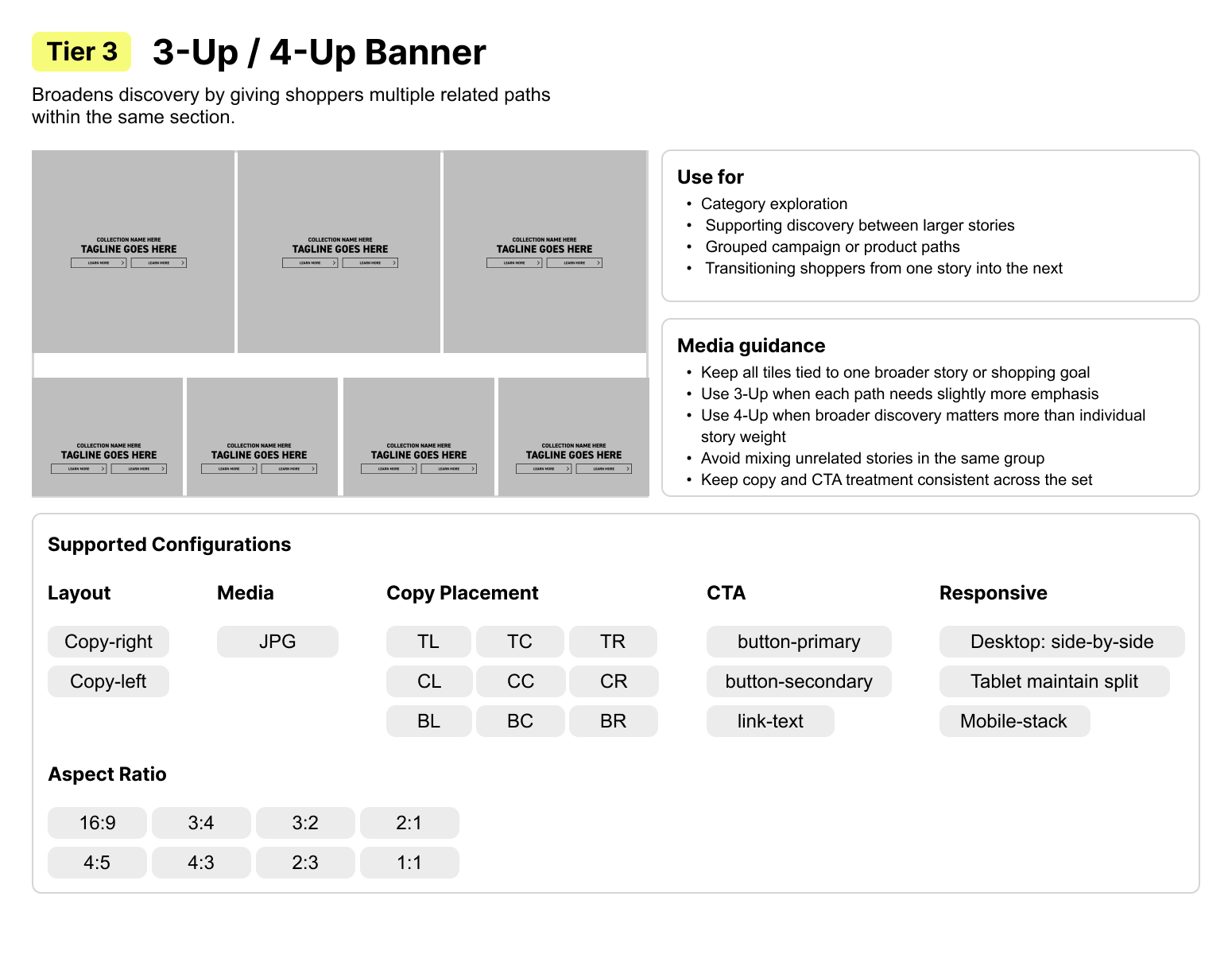
Tier 3 three-up and four-up banner usage and configuration guidance
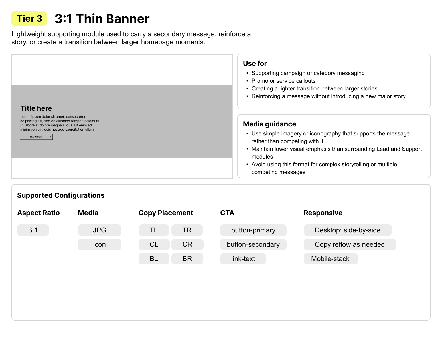
Tier 3 thin banner usage and configuration guidance
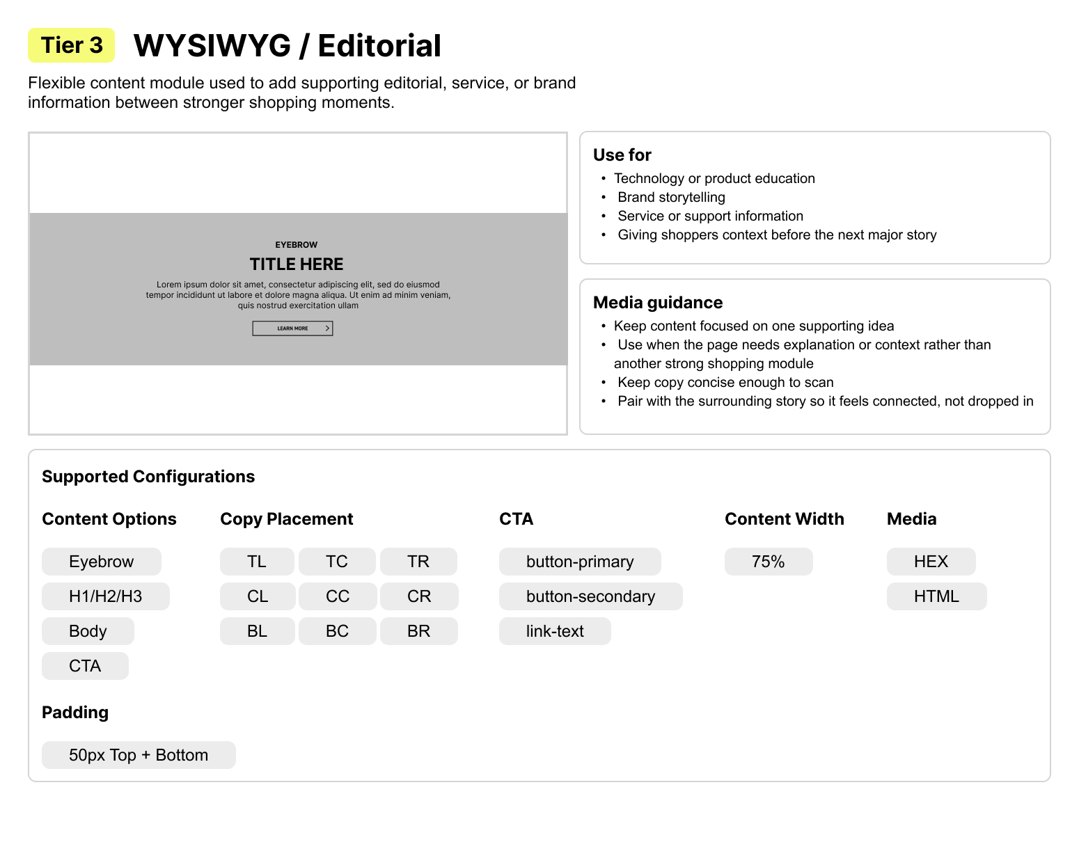
Tier 3 editorial module usage and configuration guidance
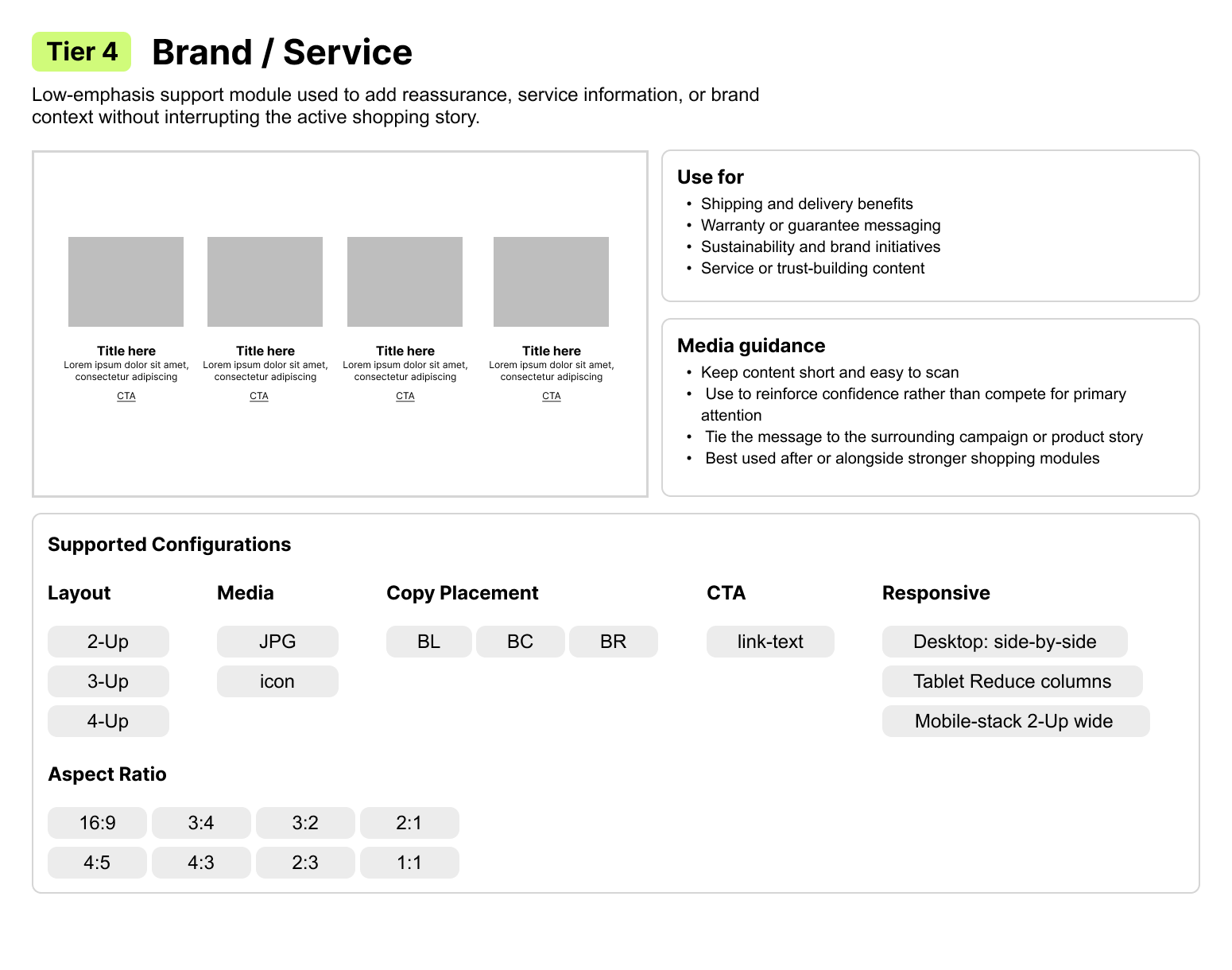
Tier 4 brand and service module usage and configuration guidance
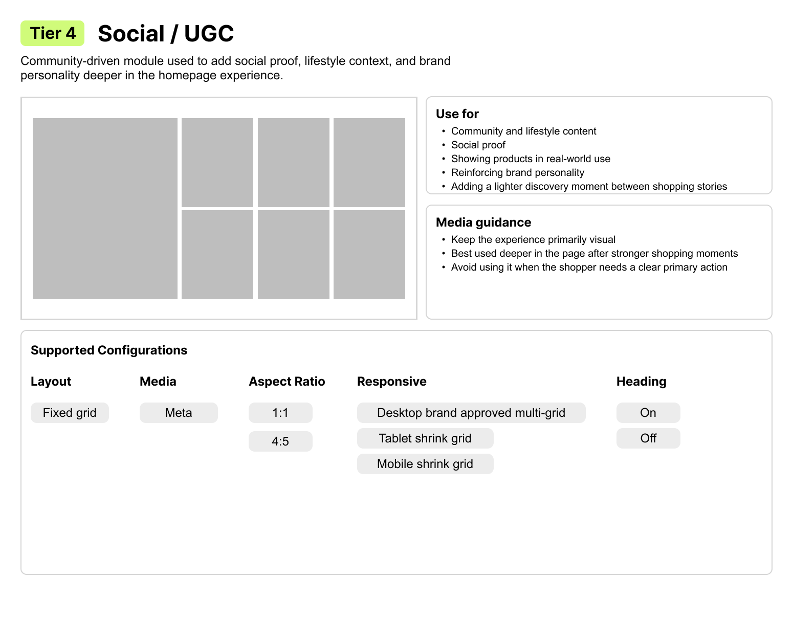
Tier 4 social and user-generated content module usage and configuration guidance
Module library Each card shows how a tier became practical guidance for use, configuration, CTAs, and responsive behavior.

04. Application

How I applied it.

I paired the module library with brand direction, composition models, and CMS requirements so teams understood what to use and why.

How teams used it.

Designers could start with the shopper, story, and business goal instead of copying one homepage structure.

Brand review

One system had to support 12 different shoppers, stories, and business needs. Open a brand to see how the shared framework changed by context.

Brand read
Approachable outdoor exploration
Shopper mode
Use-case driven and looking for moderate guidance
Homepage direction
Lead with outdoor activity, then branch by terrain, user type, or conditions.
Lean on
Hero · 3/4-Up Banner · 2-Up Product/Banner · Product Slider · Editorial
Watch for
Do not become overly technical before establishing the use case.
Brand read
Active, approachable, benefit-driven
Shopper mode
Entry-friendly; fitness, recreation, commuting, and family
Homepage direction
Lead with lifestyle benefit, then simplify discovery by use case and skill level.
Lean on
Hero · 3/4-Up Banner · Product Slider · 2-Up Product/Banner · UGC/Social
Watch for
Keep technical information supportive rather than dominant.
Brand read
Creative, youthful, athlete and culture-led
Shopper mode
Identity and riding-style driven
Homepage direction
Build energy and personality first, then branch by freestyle, freeride, park, slope, or collection.
Lean on
Hero / Video · 3/4-Up Banner · UGC/Social · Product Slider · Thin Banner
Watch for
Avoid making the experience feel overly corporate or purely transactional.
Brand read
Edgy, technical, rider-led performance
Shopper mode
Product-forward and technically confident
Homepage direction
Lead with attitude and product credibility, then support with technology and collection paths.
Lean on
Hero · Product Slider · WYSIWYG · 2-Up Product/Banner · 3/4-Up Banner
Watch for
Do not soften the experience into generic lifestyle storytelling.
Brand read
Serious, expert, safety-critical
Shopper mode
Research-heavy and confidence-driven
Homepage direction
Education and trust first, then guide into product systems and use cases.
Lean on
WYSIWYG / Editorial · Thin Banner · Product Slider · Brand/Service · Product system stories
Watch for
Do not make a safety-focused experience feel overly promotional or sales-led.
Brand read
Accessible performance with broad appeal
Shopper mode
Product-forward with lifestyle support
Homepage direction
Lead with launch and product energy, then move quickly into categories and product discovery.
Lean on
Hero · Product Slider · 2-Up Product/Banner · 3/4-Up Banner · Light Editorial
Watch for
Technical content should add confidence without dominating the first read.
Brand read
Heritage-rich, technical, endurance and performance focused
Shopper mode
Sport-specific and comparison-driven
Homepage direction
Lead with performance and heritage, then guide by discipline and support with technical education.
Lean on
Hero · WYSIWYG · Product Slider · 3/4-Up discipline paths · Thin Banner
Watch for
Strong imagery still needs clear technical and discipline-based branch points.
Brand read
Inclusive, approachable, confidence-building
Shopper mode
Beginner-friendly and use-case driven
Homepage direction
Reduce intimidation, establish an inviting outdoor story, then guide shoppers by activity and user type.
Lean on
Hero · 3/4-Up Banner · 2-Up Product/Banner · WYSIWYG · Thin Banner
Watch for
Avoid dense technical information too early in the journey.
Brand read
Technical, precise, but comfort-sensitive
Shopper mode
Decision-heavy and in need of fit and product education
Homepage direction
Help shoppers understand fit, flex, comfort, and use before pushing product.
Lean on
WYSIWYG · Product Slider · 2-Up Product/Banner · Thin Banner · Guided category paths
Watch for
Do not drop shoppers into dense product choices without enough guidance.
Brand read
Playful, expressive, culture-driven performance
Shopper mode
Vibe-forward with product validation
Homepage direction
Establish rider energy first, then branch into product types, riding style, and featured product.
Lean on
Hero / Motion · 3/4-Up Banner · Product Slider · UGC/Social · 2-Up Product/Banner
Watch for
Product modules should feel integrated into the story rather than abrupt.
Brand read
Precise, reliable, technical, and trust-driven
Shopper mode
Compatibility and confidence driven
Homepage direction
Prioritize fit, compatibility, use case, and product guidance over broad inspiration.
Lean on
Product Slider · 2-Up Product/Banner · WYSIWYG · Thin Banner · Brand/Service
Watch for
Avoid vague lifestyle stories that do not help shoppers choose the correct binding.
Brand read
Premium, precise, performance-trusted
Shopper mode
Technical and product-forward
Homepage direction
Lead with product authority, then reinforce with technology, construction, and category-specific shopping.
Lean on
Hero · Product Slider · WYSIWYG · 2-Up Product/Banner · Thin Banner
Watch for
Keep the hierarchy restrained. Lifestyle-only storytelling should not overpower product credibility.

Shopping models

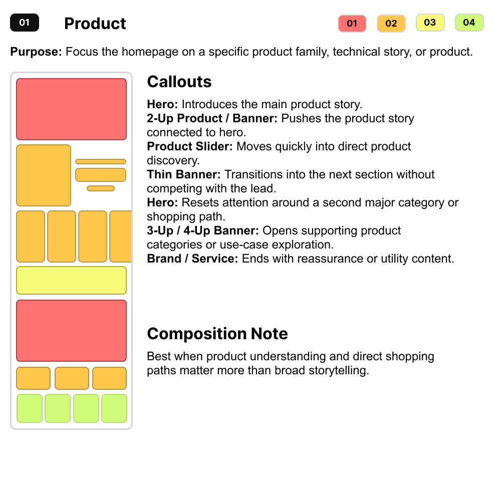
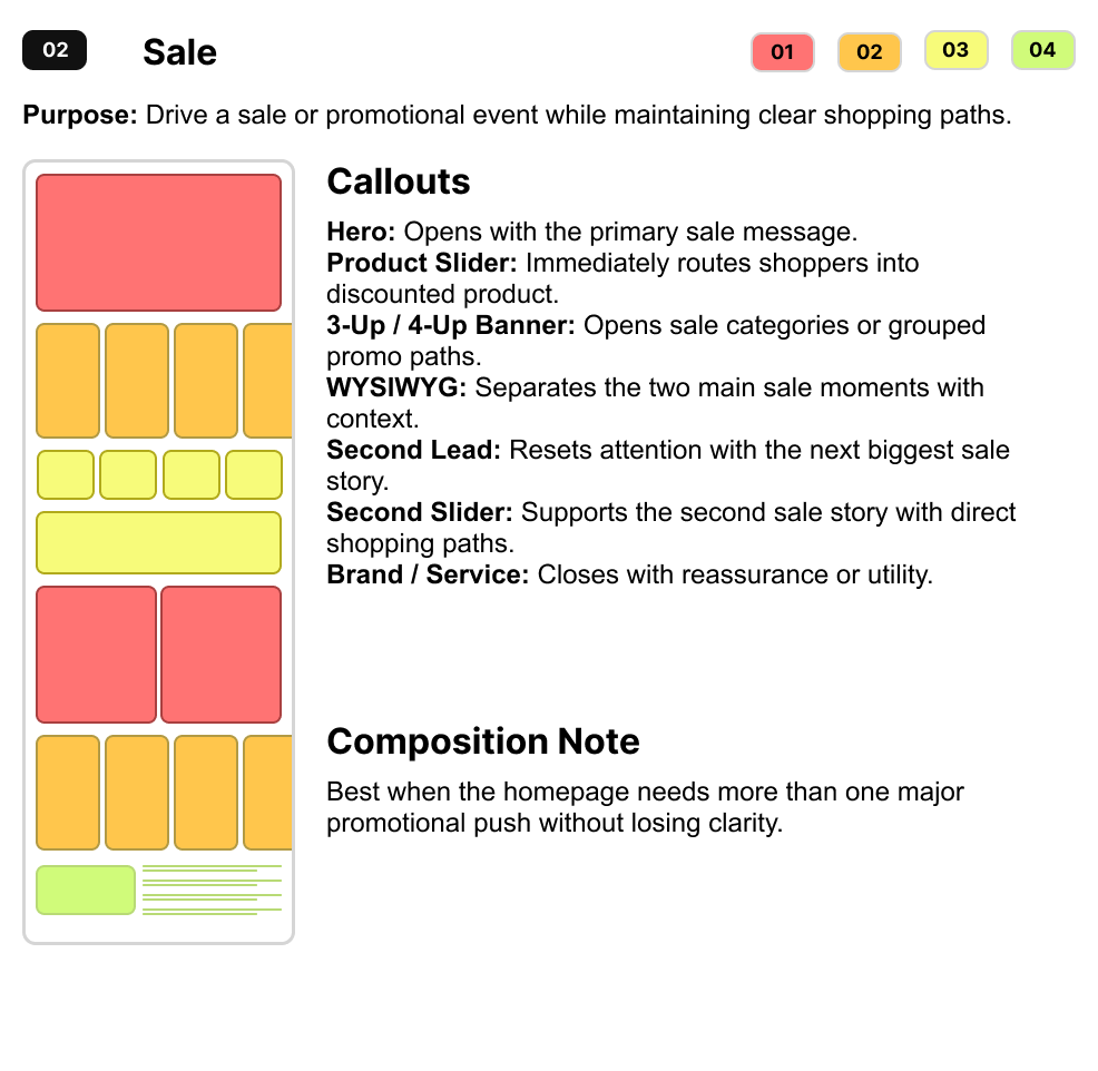
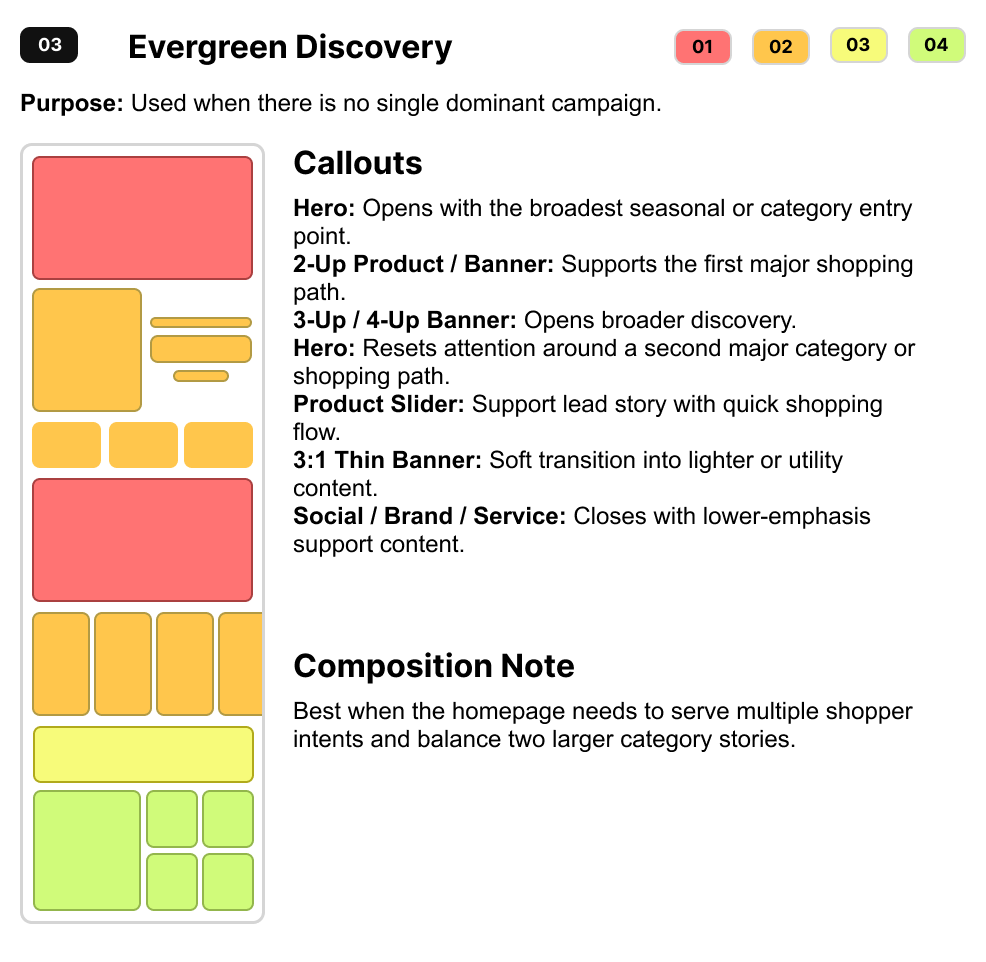
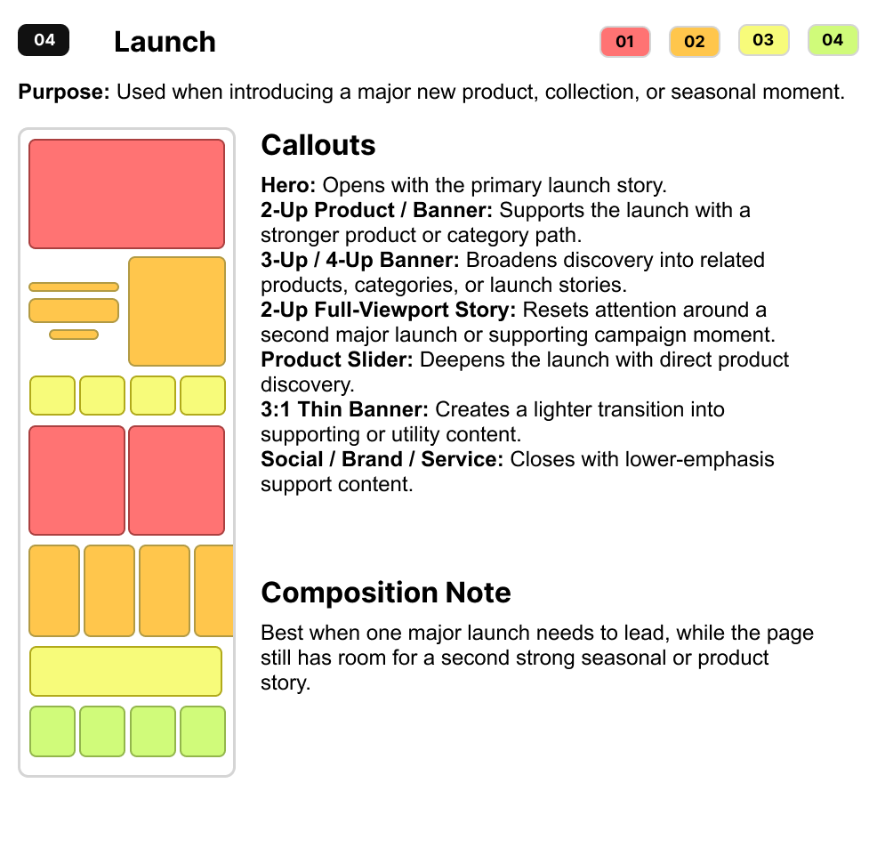
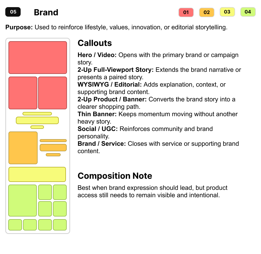
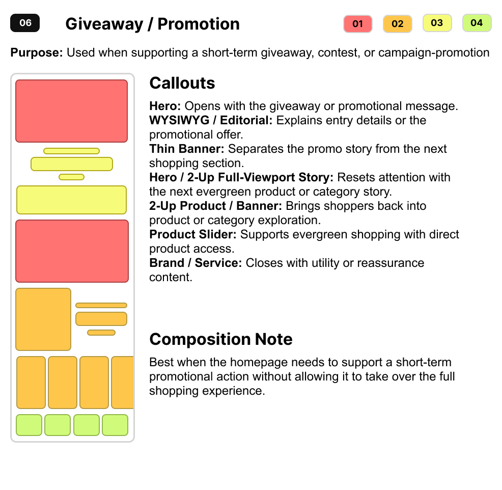
I translated the tier system into six shopping models for different shopper intents, brand needs, and campaign goals.

Product shopping model with its purpose, module sequence, callouts, and composition note
Sale shopping model with its purpose, module sequence, callouts, and composition note
Evergreen discovery shopping model with its purpose, module sequence, callouts, and composition note
Launch shopping model with its purpose, module sequence, callouts, and composition note
Brand shopping model with its purpose, module sequence, callouts, and composition note
Giveaway and promotion shopping model with its purpose, module sequence, callouts, and composition note

05. Outcome

What changed.

The flexible system shipped across all 12 brands. After launch, below-fold interaction increased 23.3%, showing that clearer hierarchy helped shoppers continue beyond the hero.

What lasted.

The framework remained in active use for more than a year and gave UX, digital design, product, and development a shared language for adapting homepage composition to different brand and shopping goals.

12

Portfolio brands shipped

23.3%

Increase in below-fold interaction

4

Teams impacted
Engineering, design, UX, and product

1+ year

Of active adoption