Bryan Brunot

I kept purchase within reach as shoppers moved deeper into the product page.

Across Elevate Outdoor Collective’s 12 brands, mobile shoppers showed interest deep in the product page, yet many left before adding to cart. I identified a gap between where shoppers were evaluating and where they could buy, then designed a scroll-triggered card to keep purchase within reach.

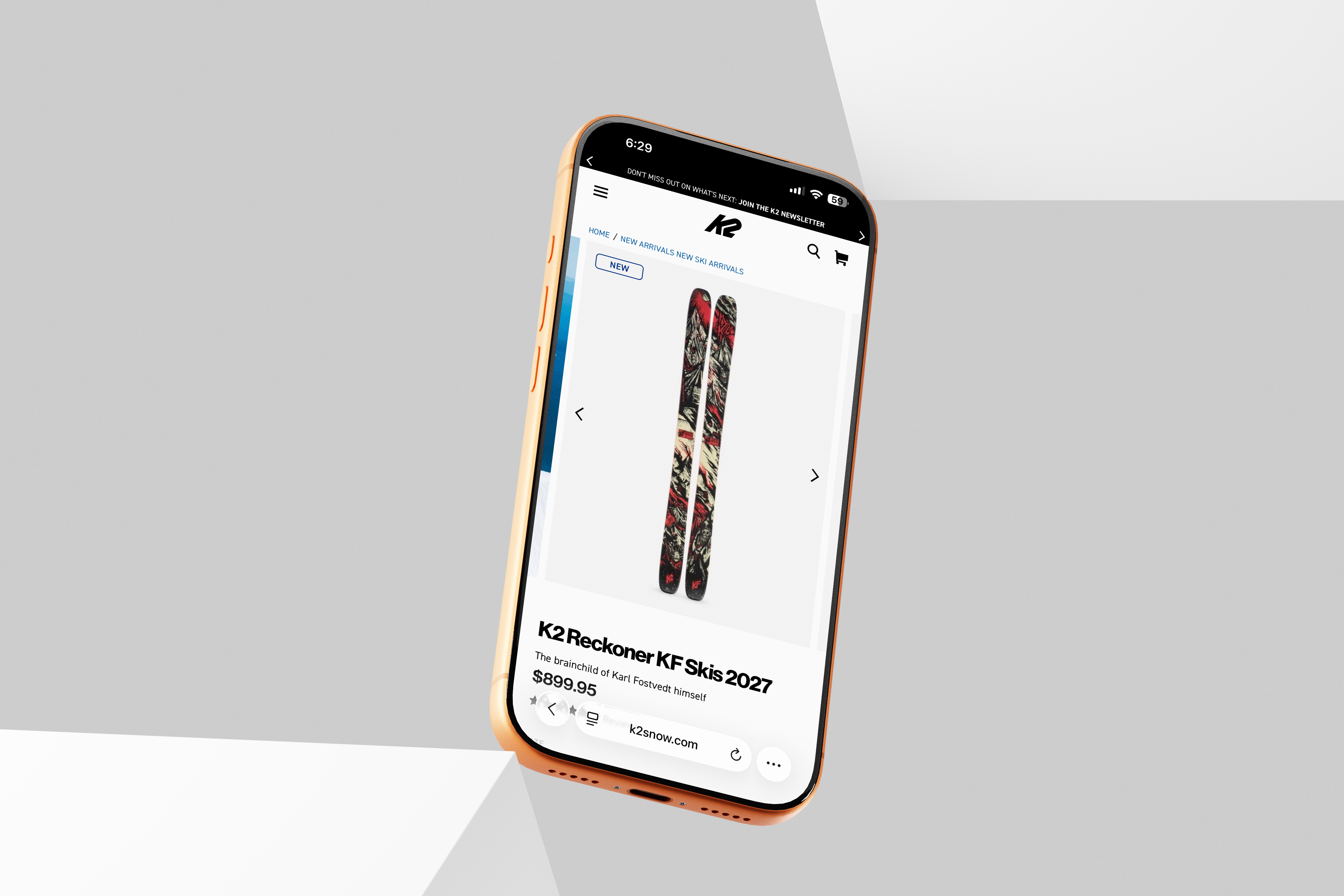
Angled orange iPhone displaying the K2 Reckoner KF skis product page
Role
Product Designer
Scope
Behavioral research
UX/UI design
Prototyping & handoff
Tools
Figma
ChatGPT
Microsoft Clarity
Figma Make
Impact
3.4% lift in mobile
add-to-cart

42% CTA click-through rate during testing

Problem

Shoppers continued evaluating products deep in the page, but purchase access stayed in the main buy section.

  • Around half of shoppers reached the end of the product features, beyond the buy section.
  • Choosing options or adding to cart required scrolling back up.
  • Many shoppers dropped off before adding to cart.

I needed to close the gap between evaluation and purchase without interrupting discovery or making the shared product page more complex.

Solution

Purchase needed to return after the main buy area left view, so shoppers could keep evaluating and act when they were ready.

I compared approaches that restored access without interrupting discovery or turning the page into a constant buy-now prompt.

01. Research

Question.

Where were shoppers still showing interest after the buy section left view, and what kind of purchase support would fit that behavior?

What I reviewed.

I reviewed tap and scroll maps across all 12 brands and benchmarked purchase patterns across 50 brands. The K2 analysis below shows how interaction near the buy area connected to exploration deeper in the page.

50-brand benchmark I found four recurring purchase patterns: a static buy area, always-sticky, scroll-triggered, and fully interactive approaches that kept purchase accessible beyond the original buy area.
Always-sticky Walmart.com
Scroll-triggered Backcountry.com
Fully interactive TheNorthFace.com

82% scrolled past the fold.

Shoppers started with the image carousel, then moved quickly into size and option selection to configure the product.

K2 product-page scroll map showing 82 percent reach near the fold, 77 percent at the purchase area, falling reach through features, and 9 percent at the final PDP video banner

K2 Reckoner PDP · Scroll-depth map

02. Design

What I explored.

I brought forward two directions from the market review: an always-sticky CTA and a scroll-triggered persistent CTA.

The tradeoff.

Always-sticky stayed present from the start. Scroll-triggered returned purchase only after the buy area left view, preserving exploration for a higher-consideration product.

Purchase access directions

Developing the scroll-triggered direction

03. Shipped

Scroll-triggered purchase card

What shipped.

A scroll-triggered card that returned shoppers to missing selections, then became a purchase point once the product was ready to add.

How it worked.

Using the PDP’s existing logic, the card:

  • Returned shoppers to the buy area to complete a missing size selection.
  • Reappeared on scroll and reflected the selection in the card.
  • Used edit to return shoppers to the buy area and change it.
  • Turned an unavailable option into an out-of-stock and Notify Me state.
  • Turned a valid, in-stock selection into direct add to cart.

04. Outcome

What changed.

The scroll-triggered card shipped across all 12 brands. During the three-week measurement window, mobile add-to-cart increased 3.4%.

What the signal showed.

About half of shoppers reached deep product content. During testing, 42% of shoppers shown the card used it to purchase or complete a selection.

12

Portfolio brands shipped

3.4%

Lift in mobile add-to-cart

42%

Of shoppers shown the card used it during testing